Flair Airlines Redesign


This case study presents a detailed UX audit of Flair Airlines' digital platforms, aiming to enhance user satisfaction and streamline the boarding process. With increasing competition in the airline industry, delivering an exceptional user experience is crucial for customer retention and brand loyalty.

Timeline

1 week

Possible Client

Flair Airlines

Role

Product Designer

Project

Personal

Tools

Figma, Miro

Setting the Scene: The Challenges of Flair Airlines


You're at the airport, rushing through security and feeling the pressure of time ticking down.

Suddenly, the app you rely on for your boarding stops working. Desperation sets in as you frantically search your phone for your information.


This was not the seamless, stress-free experience you were hoping for.

Flair Airlines is a Canadian budget airline, is favored for its affordable fares and convenient routes. However, when a friend deleted the app after struggling to access their boarding pass, it highlighted a significant issue.

This seemingly simple task proved to be quite complicated...

I decided to investigate.
How can we redesign the digital boarding pass process to be more intuitive, reliable, and stress-free for Flair Airlines passengers?

Market Discovery: Evaluating Interface Design, User Experience, and Product Usage


To gain a comprehensive understanding of user interactions with the app, I conducted a heuristic evaluation on the primary pages, with a particular focus on those related to onboarding.

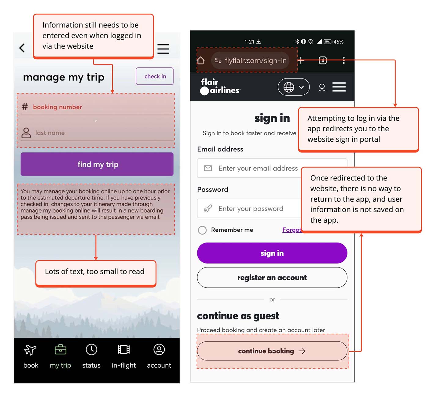
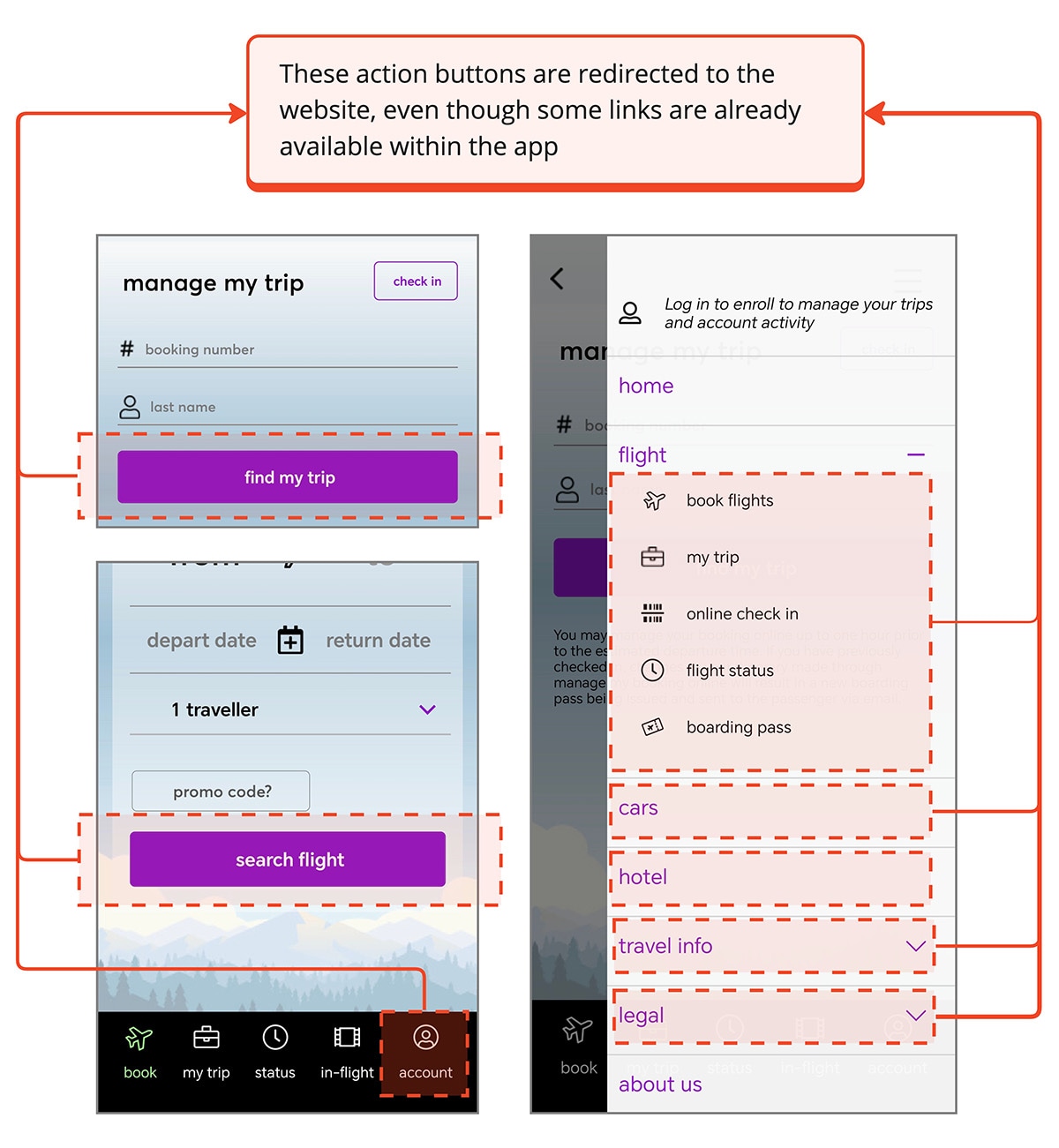
Excessive Website Redirects

Frequent Website Redirects Compromising App Value

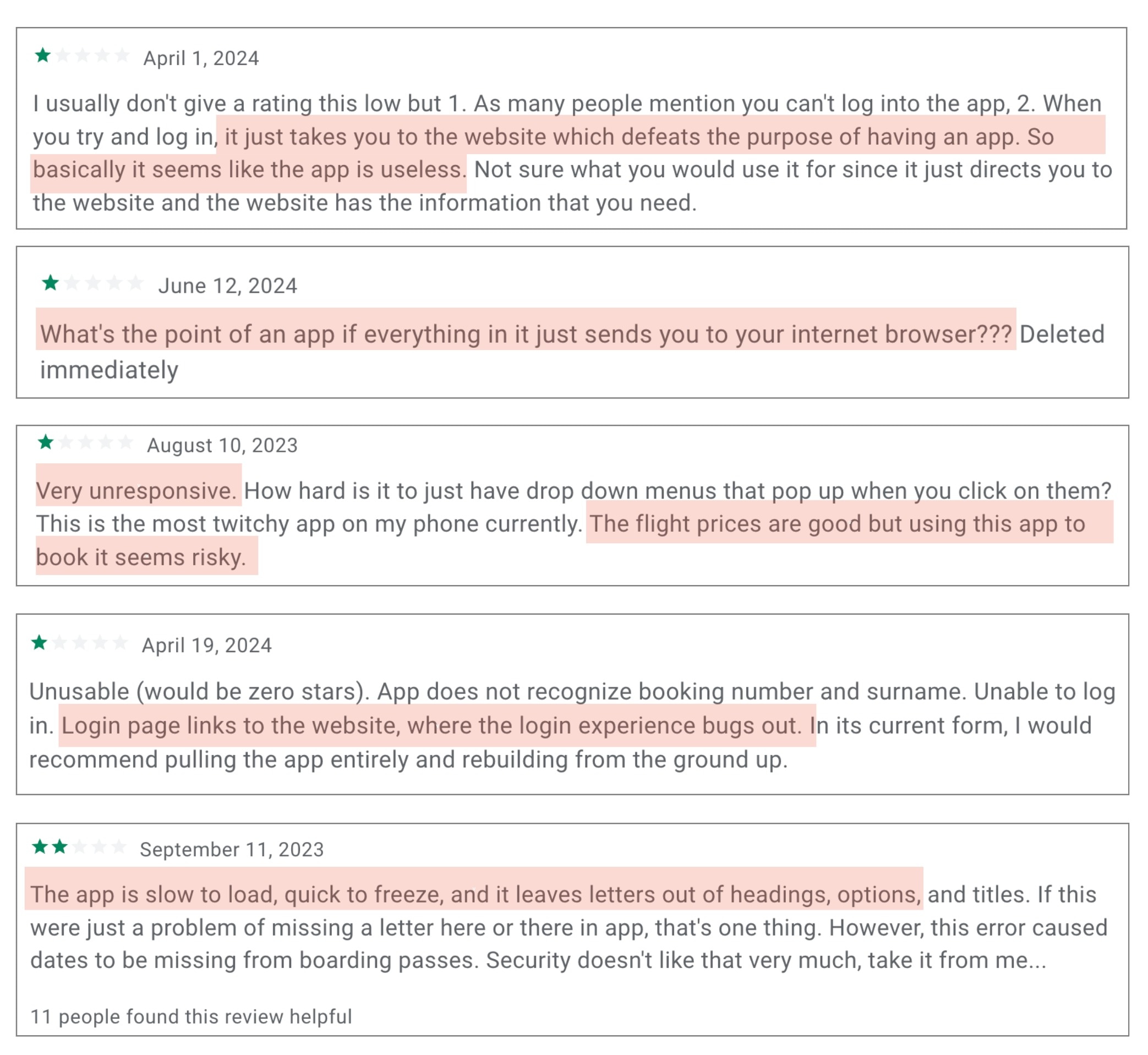
Roughly 90% of the main action buttons in the app redirect to the website, leading to inconsistent usability and disrupting the user experience. This practice compromises the unique value proposition of a native app.

If the app frequently redirects users to a website, it diminishes the perceived value of the app itself, as it forces users to rely on another product.

issue 1
issue 1
Data Retention Issues

Reduced Convenience Due to No Data Retention

As mentioned, main user flows, such as user login, are redirected to the website. Because of this, user information is not present on the app. This means users must repeatedly enter information like flight details, QR codes, and boarding passes, making the app less user-friendly and personalized. This is especially problematic for time-sensitive tasks like check-in and boarding, disrupting the seamless experience users expect.

If the app cannot retain and manage user data effectively, it fails to provide the personalized and streamlined experience users anticipate from a native application.

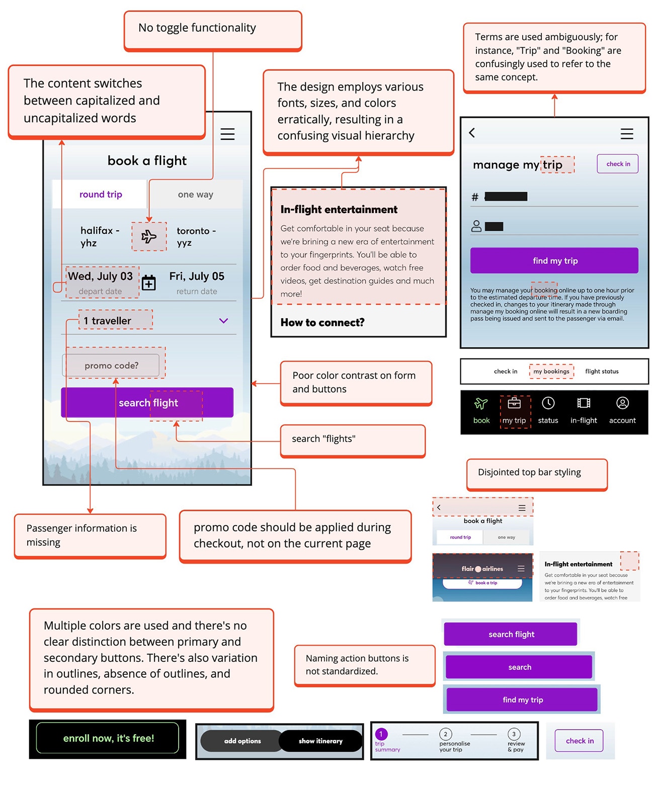
Disjointed Visual Branding

Confusing Visuals and Inconsistent Design

The app's diverse colors, text sizes, and fonts create a fragmented visual hierarchy, resulting in a chaotic and unpolished appearance. Inconsistent elements disrupt the user experience, complicating navigation and overwhelming users. This makes it challenging to understand the visual structure, causing frustration and inefficiency.

Implementing a unified design system is essential to maintaining the company's visual branding and ensuring a seamless, enjoyable user experience.

issue 1

User Interaction Analysis: Understanding App Engagement and Behavior

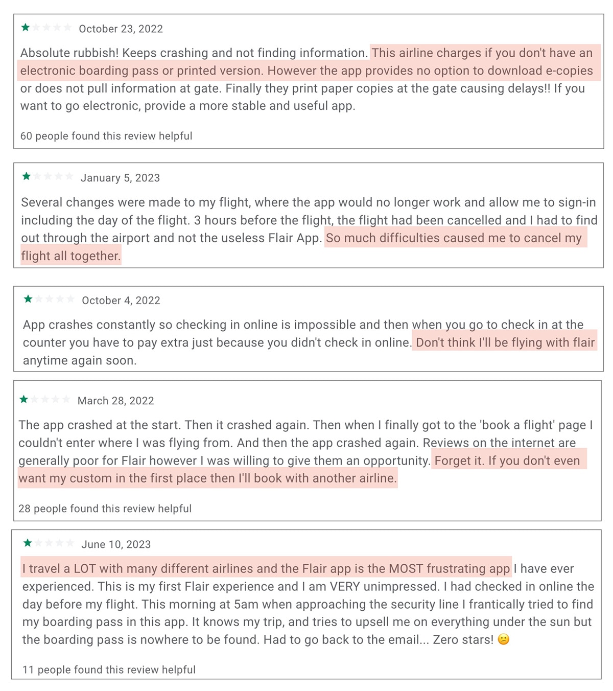
It became evident that the app had significant visual issues. To ensure these problems were not isolated incidents and to reduce potential biases, I analyzed user behavior and engagement with the Flair app. This included identifying user pain points from feedback on Facebook, Reddit, Google app reviews, and the Apple App Store.

Dissatisfaction Fueling Customer Loss

Due to poor design and lack of necessary information, users were highly dissatisfied. This frustration led to many canceling flights, abandoning the app, and switching to competitors, resulting in a significant loss of customer loyalty and engagement.

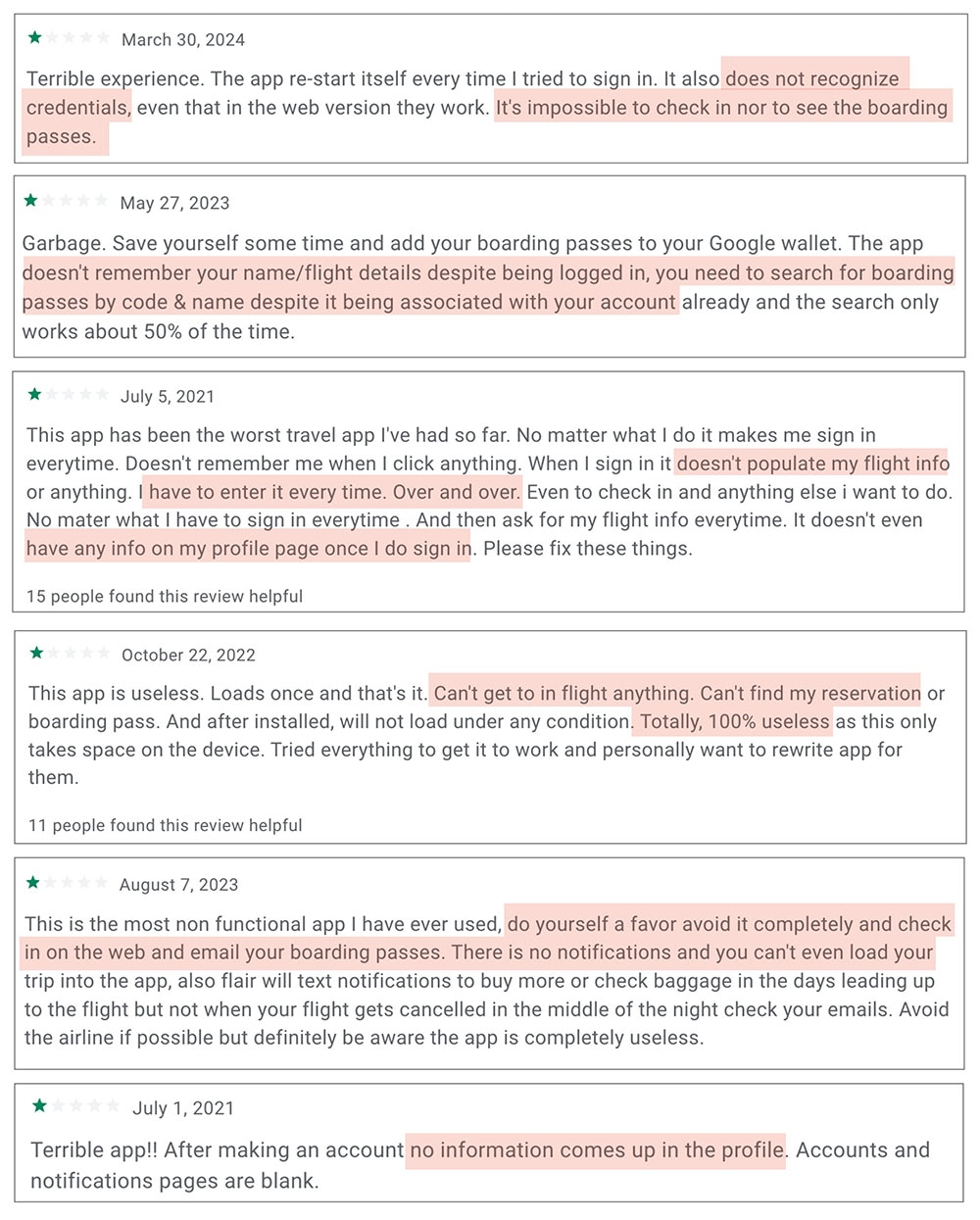
User Frustration with Data Retention

Users frequently expressed frustration with the app's inability to retain their login information and flight notifications, forcing them to repeatedly enter their details manually.

Inaccessible Data Workarounds

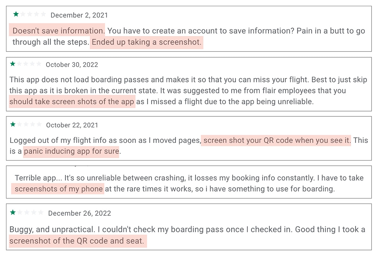
Some users were unable to retrieve crucial data, such as their boarding pass, within the app and resorted to alternative methods like screenshotting their QR codes. Ideally, this information should be readily accessible directly within the app.

Frustration Due to Website Redirections

Users consistently expressed frustration with the app's frequent redirections to the website, disrupting their experience and undermining the app's value. This constant switching led users to question the app's effectiveness and reliability.

The user feedback underscores significant behavioral and emotional challenges with the app, confirming our findings from the heuristic evaluation.

Comparative Analysis: Benchmarking User Experience Across Airlines

Airline Reviews

Higher ratings among Canadian and popular American competitors indicate they are succeeding where Flair is not. This comparison highlights opportunities to learn from industry leaders and enhance our app's performance , ultimately boosting user satisfaction and loyalty. I will reference these competitor apps during our redesign to incorporate best practices and elevate our user experience.

Defining and Understanding the Critical Issues


"A third of British respondents found the airport experience more stressful than the working week, and a quarter thought it even more stressful than moving."

Stress Reduction and User Satisfaction

Through visual analysis and user studies, I identified critical pain points in the Flair app that impact user experience. Users reported high stress when retrieving boarding passes, particularly in time-sensitive airport environments.

To stay competitive, Flair must enhance user loyalty by optimizing navigation, login processes, design consistency, and information handling. Competitors offer smoother experiences. A reliable app can reduce user anxiety with accurate, timely information, fostering customer loyalty and a positive reputation.

Website redirects cause confusion and disrupt the user journey. Inconsistent UI and frequent need to screenshot QR codes indicate functionality gaps. Unique benefits like seamless onboarding that reduce stress and build trust are crucial, increasing satisfaction and positive word-of-mouth.

Implementing user profiles, enhancing login reliability, and ensuring design consistency will ensure a seamless experience. These steps enhance usability, leading to higher retention rates and a competitive edge. Satisfied users will likely recommend the app, increasing customer lifetime value .
Possible Limitations

The current problems extend beyond visual issues; a significant portion involves users experiencing login difficulties, which may be technical in nature. To enhance the app's value, Flair needs to implement user profiles, likely requiring database integration or other technical solutions. This will be crucial and will complement the proposed design improvements.

Creating the User Personas

Leveraging our gathered insights, I developed a detailed case studies for various user personas, including frequent travelers, tech-savvy influencers, and casual vacation planners. These case studies will illustrate how different users interact with the app and identify key areas for improvement.

Image of Crystal Wang

Crystal Wang

Age: 24

Occupation: Undergrad Student

Travel Frequency: Based on travel deals

Tech Savviness: Medium

Crystal loves exploring new cities and countries whenever she finds a good deal. As a student, she is mindful of her budget and looks for affordable travel options.

"I’m always on the lookout for great travel deals. I need an app that helps me find and book trips affordably, without interfering with my studies."
Image of Jacob Loid

Jacob Loid

Age: 40

Occupation: Industrial Manager

Travel Frequency: Twice a year

Tech Savviness: Low to Medium

David plans family vacations and needs a reliable, user-friendly app to ensure smooth travel for him and his large family . He will use whatever method is easiest and prefers modern solutions.

"Traveling with kids is stressful enough. I need an app that makes things easier, not harder."
Image of Sarah Johnson

Sarah Johnson

Age: 32

Occupation: International Business

Travel Frequency: Twice a month

Tech Savviness: High

Sarah frequently travels for work and relies on airline apps. She values efficiency and clarity, likes receiving notifications, and prefers having her information, including boarding times, readily available without navigating through multiple buttons.

"I need to access my boarding pass in seconds, not minutes. My schedule is too tight for any delays."
Image of The Vlogging Squad

The Vlogging Squad

Age: 21-25

Occupation: Social Media Influencers

Travel Frequency: Frequently

Tech Savviness: High

The squad is a dynamic group of young influencers who frequently travel to create content. They are tech-savvy, prefer modern, sleek apps and will share their experiences, good or bad, with their online audience.

"Our followers expect the best from us. If we run into trouble with the app, our audience will definitely hear about it."
Image of Bob Anderson

Bob Anderson

Age: 67

Occupation: Retired School Principal

Travel Frequency: Rarely travels

Tech Savviness: Low

Bob rarely travels and prefers traditional methods over apps. Designing the app for Bob might be unproductive, as he is unlikely to use it.

"I prefer having my tickets and information on paper. Apps just confuse me and add to my anxiety."

Redesigning the App


Benchmarking Competitor Successes to Enhance UI Design

We will examine top Canadian competitors like Air Canada, as well as other airlines that have successfully implemented boarding passes, such as Delta and American Airlines, to improve the UI.

Consistency in Theme and Colors

Establishing a consistent color theme across all platforms would improve brand recognition and user experience. While promotional ads use the signature green, black, and purple, the app and web app lean more into pastel colors with images. Since the color theme is not defined for this project, I will adhere to the current design and make necessary adjustments within this framework.

Scope

We will limit the scope to two user pathways: one for signed-in users and one for guests. These pathways will cover the processes for flight boarding and check-in.

Consolidating Navigational Flow

Revamping Navigation Bar

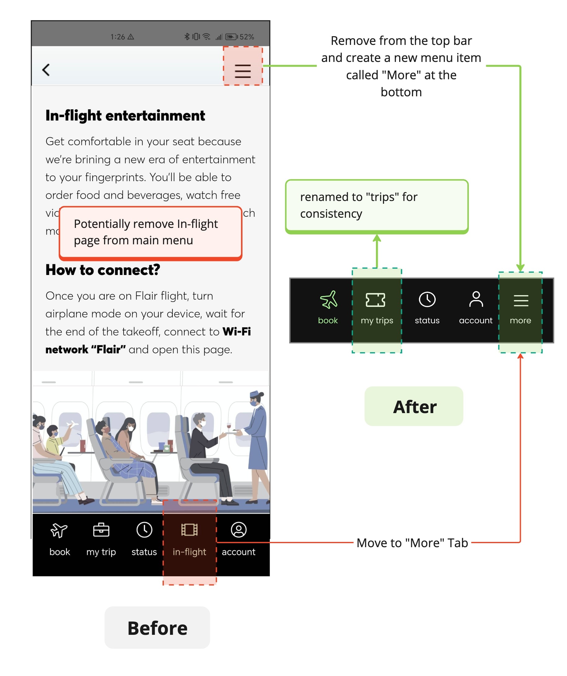
Simplify Navigation:Move the hamburger menu to the bottom in a column called 'More' to streamline access and consolidate all actions in one place.
Relocate In-Flight Page: The In-Flight page, which informs users how to access Flair online, is not directly related to booking flights. Consider moving it to the 'more' tab. Before doing so, use a heat map to analyze user interaction and determine the page's usability and frequency of use.
menu
Revamping the Flight Booking Form

Modernizing the Booking Experience

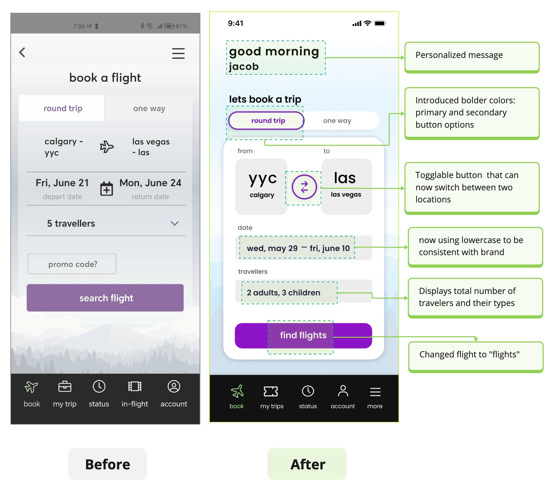
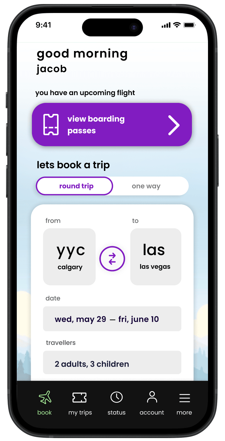
Airplane Icon: Icon now transformed to a toggle button to improve usability.
Traveler Info Display: Field now shows conveniently shows full details of travellers types.
Personalized Greeting (Optional): A greeting has been added making the app more welcoming.
issue 1
Boost Exposure for Top Deals

Maximizing Value with Flair's Budget-Friendly Deals

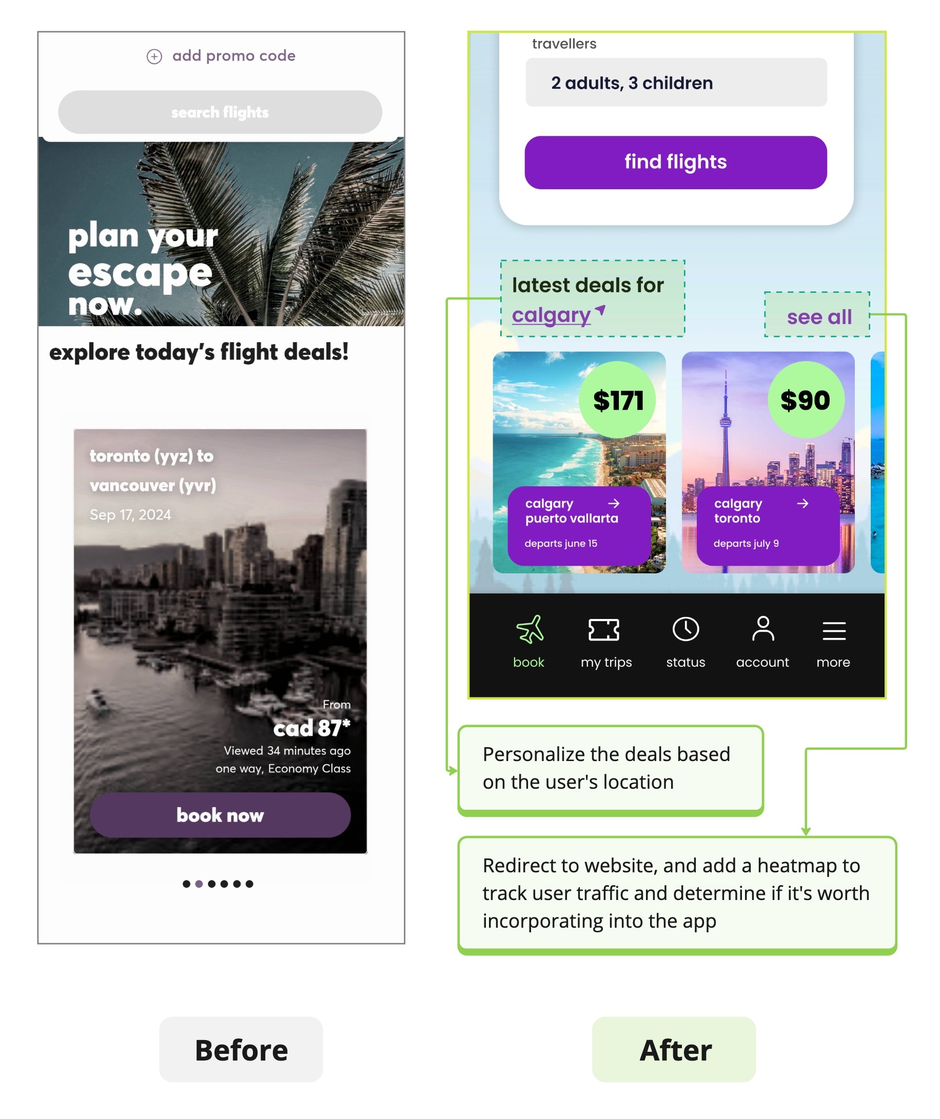
Flair's top ranking in Canada is due to its budget-friendly deals. While the website offers these travel deals, the app does not.
Include Travel Deals: Add a section for travel deals in the app to attract users. This ensures users get access to the same deals as the website, potentially increasing app usage and satisfaction.
Track User Interaction: Monitor clicks to assess interest and consider creating a dedicated tab for travel deals if engagement is high.
issue 2
Improve Accessibility to Booking

Transforming Access to Bookings

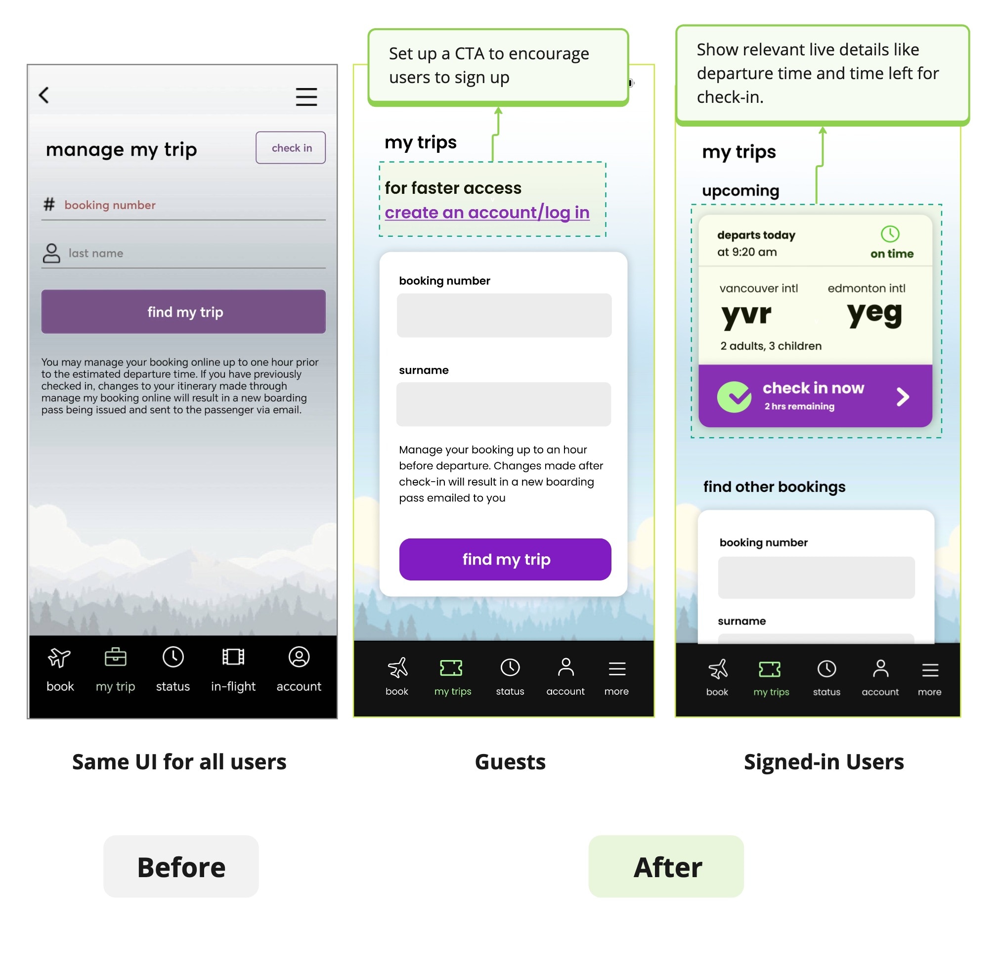
Guests: Flair lacks incentives for users to create an account. A compelling CTA button emphasizing a 'fast' experience can address this by showing how logging in streamlines their experience with automatic booking information display.
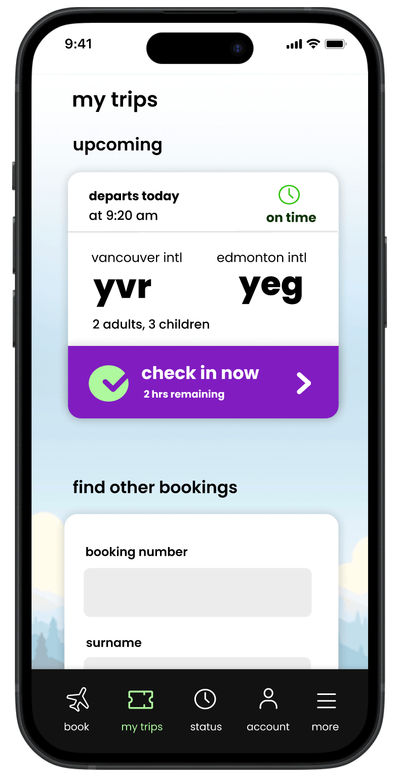
Signed-in Users: If a user is already signed in, I displayed their upcoming reservations without requiring them to input information. This addresses one of the common pain points users mentioned earlier about the product.
issue 3
Introducing Personalized Notifications

Implementing More Personalization

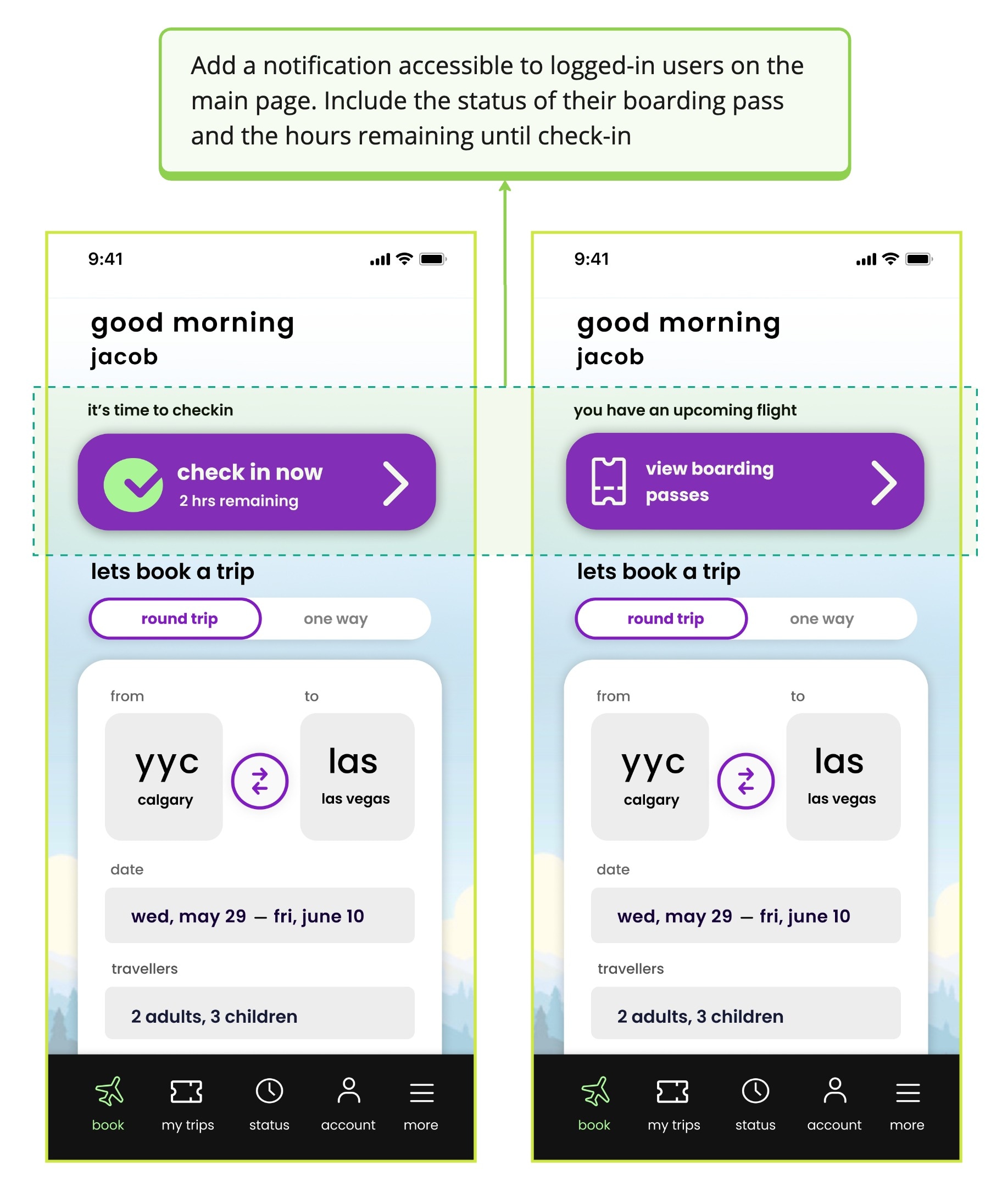
Data Retention: Building on the personalized widget mentioned earlier, I further enhanced the user experience by incorporating notifications that provide detailed flight information.

Adding these notifications to the main page will increase user convenience by displaying relevant, up-to-date information such as the time left until check-in and boarding status.

issue 4
Elevating onboarding experience

Refining the Boarding Pass

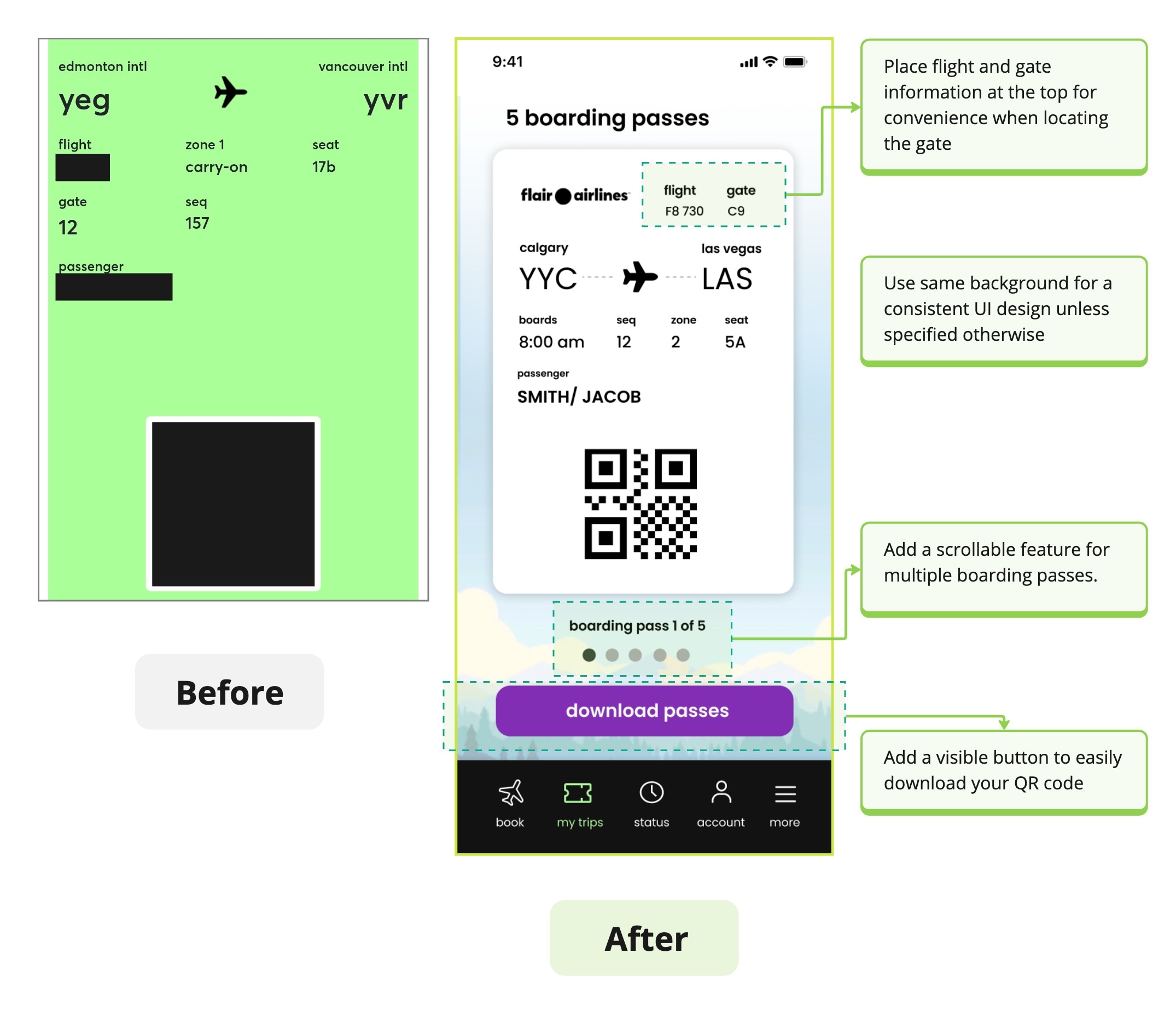
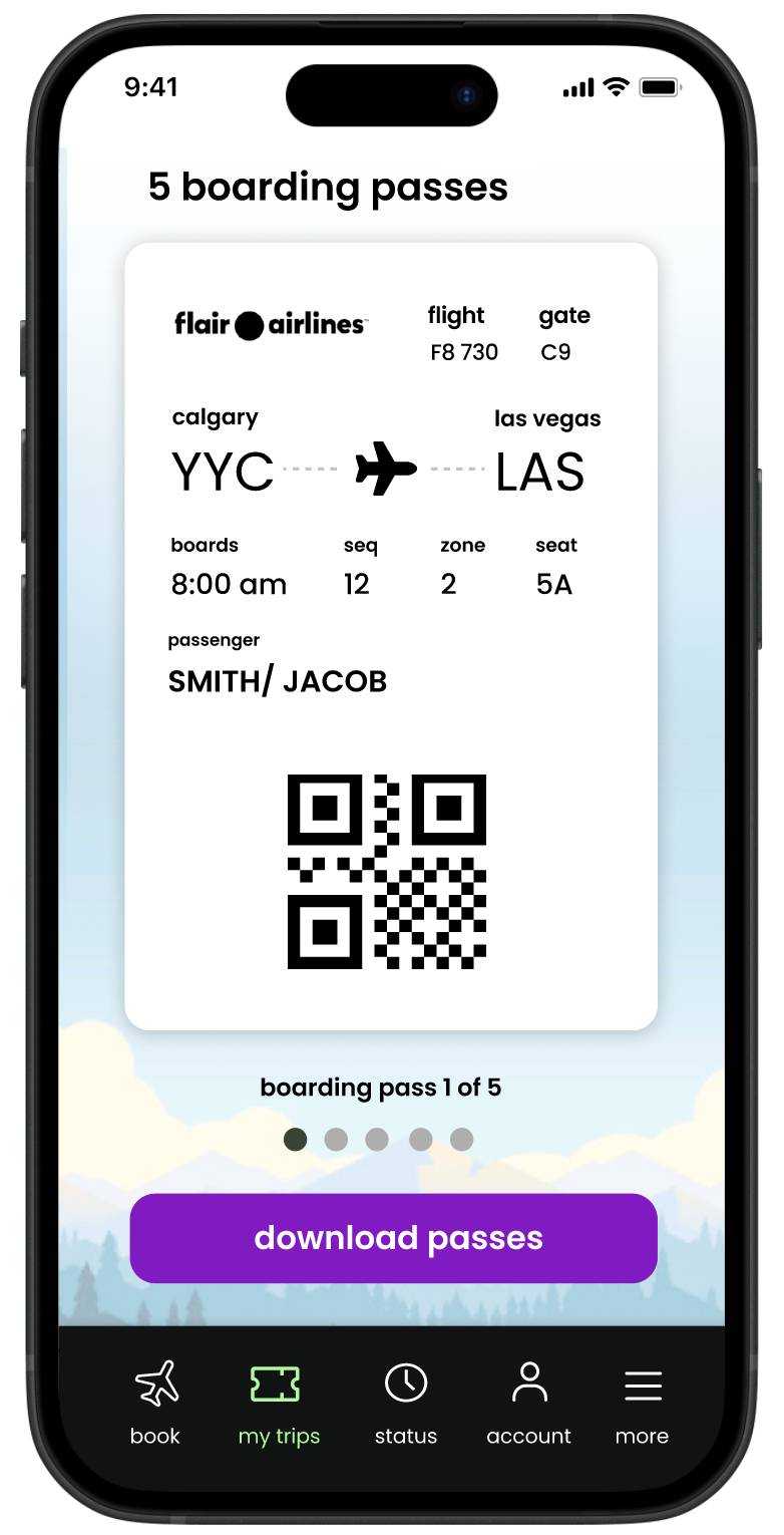
Accessible Boarding Information: Users reported issues with manually screenshotting QR codes. We've added a download button for easy access.

For larger families, I implemented a carousel feature for seamless navigation of multiple items.

I also enhanced the boarding pass by strategically placing information in convenient locations, improving the overall user experience.

issue 5

Final Design


Improved Flight Search

The app now boasts a modern UI with improved button functionality and streamlined access to information, enhancing the booking experience. Users can also view the latest sales at their location.

Easily Access Booking Information

Users can now easily view their flight status and guests can easily enter their booking details.
menu
menu

Access Notifications About your Flight

Receive notifications about the status of your upcoming flight and check-in details right at your fingertips.

Conveniently Access Boarding Pass

Your boarding pass is just a step away! Now easily downloadable and scrollable for all your passes.
menu

Takeaways and Future Steps


How We Can Measure Success

While having a direct test group of users evaluate the project is most effective, some tech-related observations we can make are as follows:

  • App Store Ratings:Track user ratings and reviews on Google Play and Apple App Store. Improvements in ratings and positive feedback signal success.
  • App Retention and QR Code Usage:Track retention through app installs and uninstalls. Also, analyze app usage duration.
  • Conversion Rate:Monitor conversion rates for users accessing QR codes and creating accounts via the booking tab CTA.
  • Page Impressions:Analyze button interactions and page activity to identify high-engagement areas. Extend this analysis to the website for additional insights.

Understanding the direction of Flair's branding

For this project, I experimented with various colors and themes but ultimately kept it consistent with the app's current visuals to match the website. However, Flair's branding appears inconsistent. It would be interesting to see if they will return to their original branding. Understanding the future direction and branding strategy would be beneficial.

Final Thoughts

While there were many areas that required improvement with Flair, addressing the onboarding process was particularly interesting due to the real-life consequences of a poorly designed UI. I thoroughly enjoyed identifying pain points and developing features that significantly enhance the app. Sometimes, a small feature can generate substantial returns. While UI design is crucial, understanding user pain points and creating solutions is equally important. This case study provided a valuable opportunity to delve into these aspects and improve the overall user experience.

Thanks for Reading!
© Kim 2024. This site was designed in Figma, coded in Next JS by yours truly, styled with Tailwind and deployed on Vercel.